Nikolay
Well-known member
- Joined
- Dec 15, 2020
- Messages
- 195
I am sure that many players will support me.
For many years now, as soon as the “Lucky Museum War Crafting!” event begins, players have been diligently looking for artifacts to improve the parameters of their museum. This takes a lot of time, many, many hours.
On the Artifact Search Screen, only 5 lines describing the benefits and their starting percentage are important for the player. The rest of the information is secondary.
At the same time, the description of the benefits is displayed in small print and after some time the eyes begin to get very tired because they have to concentrate so much.
The design innovations have been very good over the past year.
I am sure that your designer is able to correct this situation and take care of our eyes.
This would be a great addition to "Quality of Life".
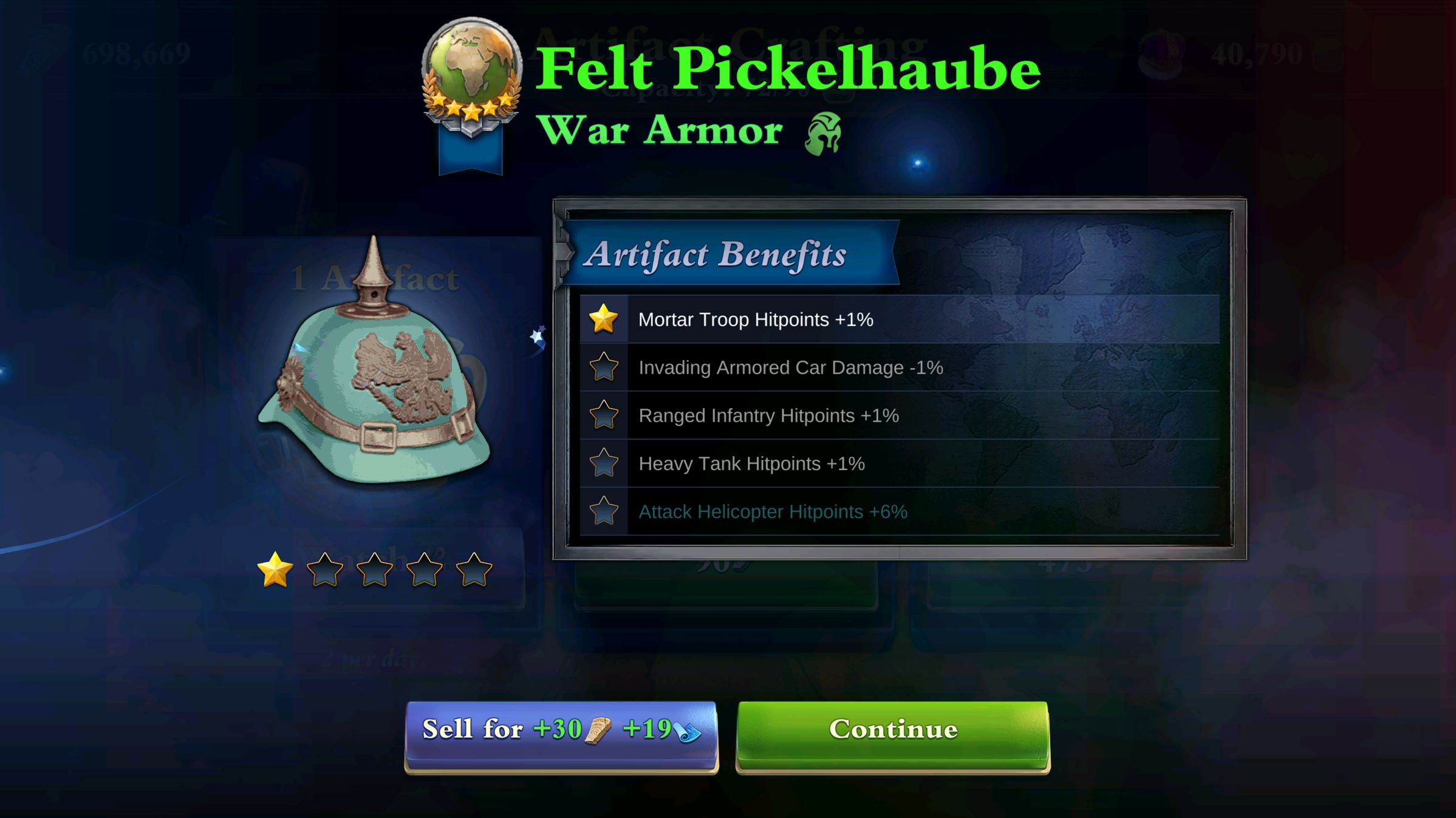
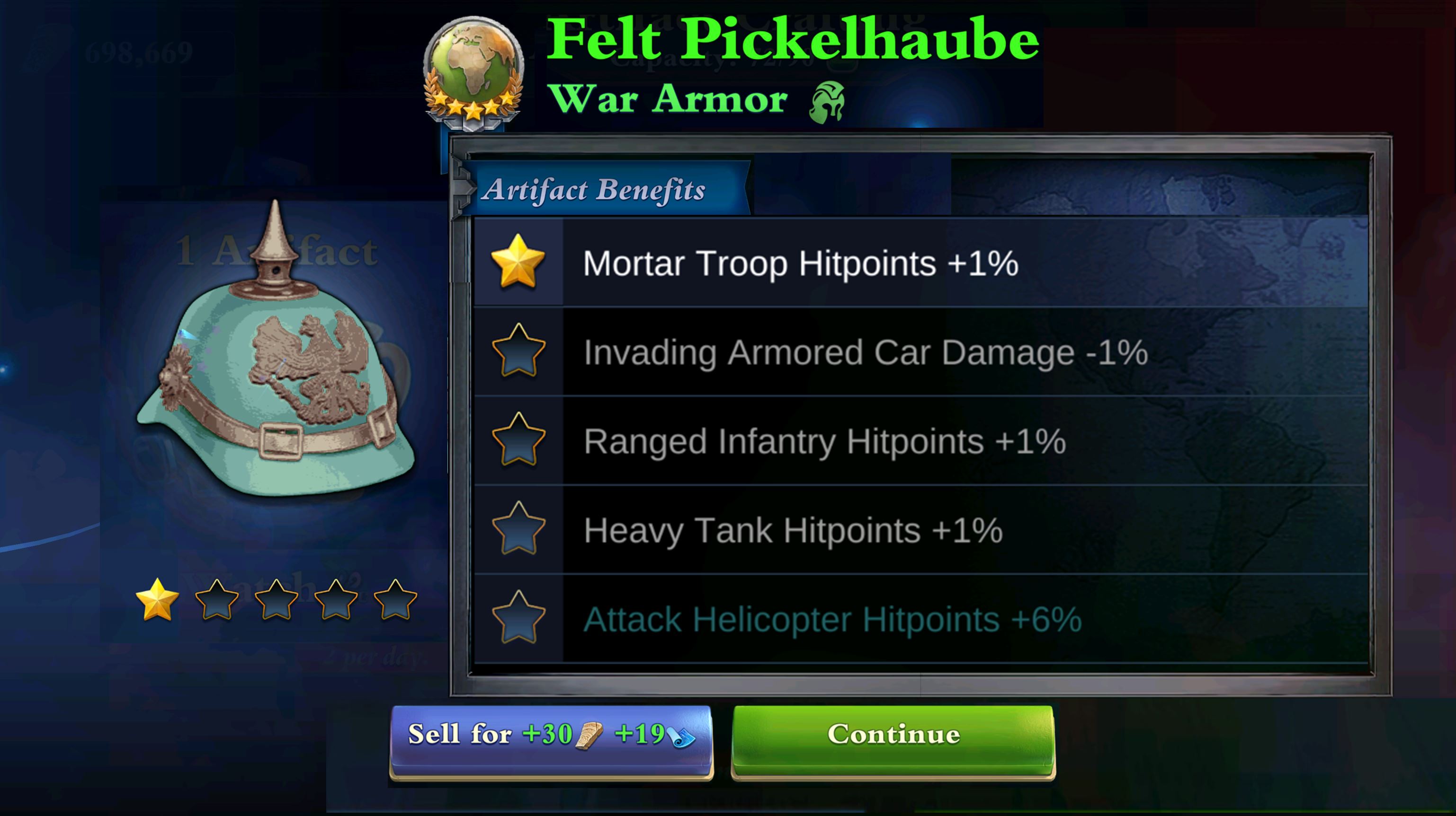
I'm not a designer, but just as an example, I'll attach two screenshots - what the screen looks like now and how it would be better. Of course your designer can do much better
The main thing is that the emphasis is on five lines describing the benefits of the artifact and their starting percentage.
@Harlems369th, if possible, please include this in future additions.
As is:

To be:

For many years now, as soon as the “Lucky Museum War Crafting!” event begins, players have been diligently looking for artifacts to improve the parameters of their museum. This takes a lot of time, many, many hours.
On the Artifact Search Screen, only 5 lines describing the benefits and their starting percentage are important for the player. The rest of the information is secondary.
At the same time, the description of the benefits is displayed in small print and after some time the eyes begin to get very tired because they have to concentrate so much.
The design innovations have been very good over the past year.
I am sure that your designer is able to correct this situation and take care of our eyes.
This would be a great addition to "Quality of Life".
I'm not a designer, but just as an example, I'll attach two screenshots - what the screen looks like now and how it would be better. Of course your designer can do much better
The main thing is that the emphasis is on five lines describing the benefits of the artifact and their starting percentage.
@Harlems369th, if possible, please include this in future additions.
As is:
To be:
